How to Build a Monochrome Wardrobe That Doesn't Look Flat
Sep 25, 2026 · Dana Reyes
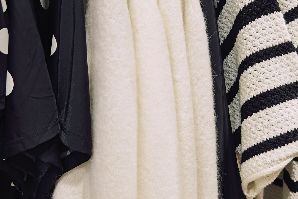
Monochrome dressing gets described as a look — head-to-toe black, vaguely architectural. It is more useful as a method: restrict the hue and you remove most of the decisions that make getting dressed slow. Everything goes with everything, because there is only one colour to reconcile.
The method fails in a predictable way, though. Remove colour and you have also removed your main source of contrast, and an outfit with no contrast reads as flat. The skill is putting that contrast back using something other than hue.
Why it works
Two practical reasons, rather than any claim about elegance. First, a single hue means every piece in the wardrobe pairs with every other one, which is the same pair-ability rule that makes a capsule wardrobe function — applied by colour instead of by curation. Second, an unbroken column of one colour gives the eye nothing to stop at, so cut, drape and fabric condition carry the outfit. That is the standard argument for why monochrome reads as considered rather than plain, and it is a visual impression, not a rule: it will not rescue a bad fit.
There is a cost. With no colour to draw the eye, fit and fabric wear become more visible, not less. A shoulder that sits wrong is easier to see against a single tone.
Choosing your base colour
Start from what you own, not from what suits you in the abstract. Pull everything in the closet that you wear weekly and see which colour dominates — that is your base, because building on it costs the least. If nothing dominates, pick from the three that are easiest to build:
- Charcoal or soft black. The widest range of available values, and the easiest to dress up. Hardest part is matching blacks across fibres.
- Ink or navy. Softer against a wider range of skin tones than black, and navy pairs with denim without looking like a uniform. Watch that navy reads black under warm shop lighting and blue in daylight.
- Camel, oat or stone. Warmest of the three and easiest in daylight, but the lightest values show soil and wear fastest, so it demands more laundering discipline.
Whichever you pick, decide it once and check new purchases against it. The base colour is more binding than any individual garment.
Work in values, not one flat tone
The most common mistake is treating monochrome as one tone. A wardrobe of things that are all approximately the same black has no depth — it photographs as a shape rather than as clothing.
Build three to five values inside the hue instead: one deep (ink), one dark (charcoal), one mid (grey or taupe), one light (oat), one near-white (ecru). Then use at least three values per outfit. Two reads flat; four or five starts to look like you were aiming for a gradient rather than an outfit. The values do the work that colour contrast would otherwise do.
Let fabric create the contrast
Texture is the second lever, and the one that separates a good monochrome outfit from a slab. Fibres take light differently, and that difference is visible even when the colour is identical:
- Matte and absorbent — wool flannel, boiled wool, cotton flannel, brushed cotton. Soaks up light, reads deep and soft.
- Smooth and matte — merino jersey, cotton poplin, heavy cotton twill. Flat surface, reads crisp and slightly lighter than the same dye on flannel.
- Lustrous — silk, lyocell twill, satin, polished leather. Reflects light, reads brightest of the three at the same dye depth.
- Textured by construction — rib knit, corduroy, quilted nylon, canvas. Shadow from the structure itself, independent of colour.
A workable rule: every monochrome outfit should contain at least two of those four categories, ideally three. Charcoal flannel trousers, a charcoal merino crew and black leather boots gives you matte-absorbent, smooth-matte and lustrous in one colour — three finishes, zero colour decisions. Drop the boots for matte canvas sneakers and the same outfit loses a full stop of contrast.
This is also where reading a composition tag pays off: fibre content tells you the surface finish before you buy, and the finish is what you are actually shopping for in a monochrome wardrobe.
Where monochrome goes wrong
Same tone, same texture. The flat-outfit failure described above. Charcoal jersey over charcoal jersey over charcoal jersey, with nothing reflective or absorbent to break it, looks like a uniform you were issued.
Chasing one true black. Different dye lots of the same garment differ, and the same nominal black on cotton, wool and nylon will not match — fibres take dye differently and finishes shift the depth further. Trying to make them agree is the most common way people give up on monochrome. Instead, decide that your “black” is a narrow range, and lean into it deliberately: a soft-black knit with a charcoal trouser reads as intentional, whereas two near-identical blacks that do not quite agree read as a mistake. Buy pieces you intend to wear together in the same season where you can, and check them in daylight, not in a fitting room.
No focal point. An uninterrupted column needs somewhere for the eye to land. One break is enough: a lighter value at the neckline, metal hardware, a lustrous shoe, or a single textured piece. Without it, the outfit reads as a block.
Fading that breaks the range. Black and indigo cotton fade, and they fade unevenly — at the folds, the seat and the cuffs. A monochrome wardrobe is less forgiving of this than a mixed one, because a half-faded black sits visibly outside the range you built. Wash cold, wash less often, and dry out of direct sun. Knitwear pilling has the same effect: a pilled black sweater scatters light and leaves the range.
Starting from what you own
Sort, don’t shop. Pull every garment in your chosen family, lay them out, and sort into three piles by value — dark, mid, light. In most closets one pile is empty, usually the mid. That is the gap to fill, and it is usually one garment.
Then check texture coverage: if everything in your dark pile is smooth jersey, the fix is not another jersey. It is one piece in a different finish.
A note on how long it holds
Monochrome is the easiest wardrobe system to maintain and one of the easier ones to get bored of, because the palette stops supplying novelty. Two things help. Keep one adjacent neutral — ink next to navy, charcoal next to black — so there is somewhere to go. And keep a small number of pieces outside the family entirely; a wardrobe with no exceptions starts to look like a policy rather than a preference.
FAQ
- Does a monochrome wardrobe mean wearing only black?
- No. Monochrome means one hue family, not one colour. Navy, grey, camel, olive and cream all work as a base, each with its own range of light and dark values. Black is simply the most common starting point.
- Why do my blacks not match each other?
- Dye lots, fibre and finish all shift a black. Cotton, wool and nylon take dye differently, so a black tee, a black sweater and a black rain shell are rarely the same black. Choose a deliberate near-black range instead of chasing an exact match.
- How many shades should one outfit use?
- Three values is a reliable floor: one dark, one mid, one light, all in the same family. Two tends to read flat, and four or more starts to lose the effect. Texture can substitute for one of them.
Edited by
Dana Reyes
Researches garment construction, fibre content and brand sustainability claims. Ten years between the retail floor and editorial fact-checking.